In Part 1, we focused on lean thinking, so we can accomplish more, reliably and consistently. In Part 2, we discussed how local variation can enhance a team’s adaptability. In Part 3, we explained cycle time, lead time, and seeing the team’s actual internal data.
In this part, we’ll address how the team can use its internal data to create externally consumable forecasts. Then, the team can easily explain those forecasts to others.
Create Useful Forecasts Based on Actual Data
Once teams know their cycle and lead time, they can create reasonable forecasts. Even if they have wildly varying cycle times.
Many teams try to use story points as the basis of a forecast. Story points seduce teams into thinking that if the team can assess the relative complexity of a story, the team can estimate or forecast when they can complete the work.
We’ve seen use of story points successfully to forecast under these circumstances:
- When the team splits the story into a size of “one.”
- When the team only works on one product at a time, so the team doesn’t confuse themselves with a context switch.
- When the team manages its overall WIP.
You might be surprised by the size of “one.” Johanna has seen teams succeed when their size of one is roughly a one-day story. Michael has seen teams succeed even if their “one” is a week.
When teams use a relatively even size of “one,” the teams use story points as an equivalent of their cycle time.
Story points are a measure of capacity, not duration. If you want to forecast, you need to understand durations, especially if you have delays in your work.
Use Cycle and Lead Time to Reflect, Visualize, and Forecast
Once you see your delays, you can replace estimation by forecasting based on actual data.
You might ask about velocity—can’t that help your team plan for the future? We rarely see velocity as a useful metric. That’s because velocity is a measure of capacity, not time.
Velocity treats a team as a measuring cup—8 oz is always a cup. However, teams aren’t measuring cups. Sometimes, they discover the “simple” problem isn’t simple at all. The team might have to experiment and discover to finish solving the problem. That’s why cycle time is more useful than velocity for seeing the immediate past, visualizing the team’s progress, and forecasting the future.
We already discussed cycle time and lead time. Notice that you can generate those charts by hand. We used drawing programs to draw them for this article, but we always start with hand-drawn charts.
When teams use stickies on the wall or stickies in a tool (as opposed to a ticketing system), Michael uses an easy-to-generate histogram of cycle time:
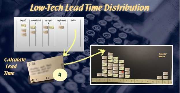
As the team finishes the item (instead of putting it into the In Use column), the team adds that sticky to the cycle time chart.
The team created the cycle time chart with the number of days along the X axis. The number of items creates the Y axis.
As the team finishes items, the team can see their cycle times. This team, as with many teams we see, has a higher concentration of items to the left of the graph. And, they have some items to the right of the graph.
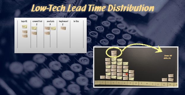
To establish a sound baseline for future work this team watches its 80th percentile to predict what time it takes to complete 8 out of 10 items. For a typical short-term project, this is a calculation that can easily be done by hand. 80% of 31 items is 25 items and a very small bit of counting. The 25th card indicates the 80th percentile–25 cards are at the 80th percentile or below. Six cards are above.
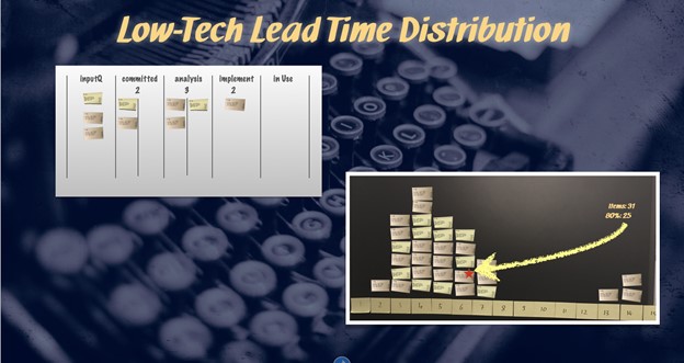
Note that when you create a cycle time chart over time, you have all the data you need to create probabilistic schedules.
Cycle time and lead time are just two out of many possible metrics to visualize. We have found that visualizing lead and cycle time creates many possibilities for the team to improve their agile approach:
- When teams see their cycle time, they can create expectations about when they might be done at various times.
- Really seeing cycle time allows the team to move from estimations (guesses) to probabilistic forecasting.
- We have seen teams use cycle time to move from batching work to much more of a flow approach to work.
As the team(s) make progress on their work, we recommend the team visualize its progress towards the finished product. In addition, the team can update the forecast with real data.
Visualize Product Progress with a Features Chart
Let’s assume the team creates a feedback cycle with the business people or the customer. Although one of the best ways to have such a feedback loop would be an on-site customer as described in XP, that may not always be feasible. We often see that feedback loop in the form of demos.
The team and the business people learn as they create and refine the product, That means the number of features will change during the development. Your team can use a feature chart (from Create Your Successful Agile Project) :
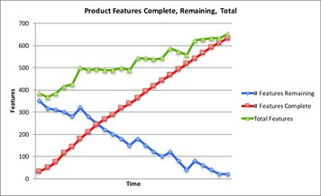
The Total Features (the top green line burnup) in the Product Features chart shows how we add (and remove) features as the team creates and learns. We add more features, and every so often, subtract features.
The Features Complete line (the red burnup) shows everyone what the team completes.
And the Features Remaining line (the blue burndown) shows us what’s left to do.
If you only tracked one of these lines, you wouldn’t have the total picture of what’s going on. Also, notice that each line is a trend line. The team uses empirical data to explain their progress.
The Features Complete also shows an implied relatively constant cycle time. If the red line went up faster, we know we finished this work faster. If the red line stalls or even drops, we know we’re taking longer to complete the work. Teams can use the Features Complete burnup as an early warning signal.
You might need to see that Total Features burnup by feature set. In that case, use a product backlog burnup chart.
Product Backlog Burnup Chart Shows Feature Set Growth and Completion
You might encounter this problem. You can see the Total Features line continues to increase. And, even though the team makes regular progress, they don’t feel as if they’re getting closer to the end. That’s where the Product Backlog Burnup Chart (from Create Your Successful Agile Project) can help.
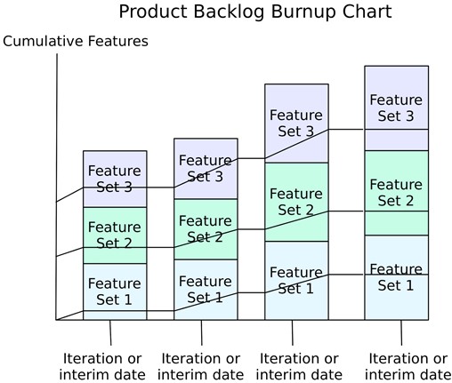
At regular intervals, the team assesses where they are for the given feature sets. This image shows just three feature sets, on a weekly basis. In the first week, the team completes a couple of stories in Feature Set 1, a few more in Feature Set 2, and about half the stories in Feature Set 3.
In the next week, the team sees this data:
- Feature Set 1 grew by about a story, and the team finished more stories.
- Feature Set 2 grew a little more, and the team finished some stories.
- Feature Set 3 didn’t grow, and the team finished a couple more stories.
Week 3 shows a changed context:
- All three feature sets grew.
- The team made progress in all three feature sets.
- And, despite the team’s progress, they don’t feel as if they’re making progress. That’s because the feature sets continue to grow faster than the team can finish stories.
Week 4 shows a similar context, although Feature Set 1 doesn’t appear to grow as fast as the other two feature sets.
You might wonder why there aren’t numbers on this chart. Imagine what would happen if we had labeled Week 1’s feature set as “2 stories out of 10 complete.” Week 2 would be “4 stories out of 12 complete.” Week 3 would be “6 stories out of 15 complete.” Week 4 would be “7 stories out of 16 complete.”
People can do arithmetic. The team doesn’t look like it’s making progress. The team is progressing, but not linearly for each given feature set.
We often want uneven progress in a given feature set. We might realize that different stories in different areas of the product are more valuable than what we had initially planned.
Sometimes, people (managers or the team) worry the team isn’t finishing an entire feature set and want the team to focus on one feature set at a time. We think it’s more important to look at the overall WIP.
Consider Measuring Cumulative Flow to See the Various WIP
Teams perform all kinds of work:
- Gathering requirements and learning about them.
- Analysis, where the team discusses the requirement(s) and considers alternatives to implement and test it.
- Code and unit test. We are both fans of TDD (Test-Driven Development), which is why we lump these activities together.
- We think of testing as any form of testing that occurs at a higher level than a unit test.
If teams don’t limit their team-based WIP to one item at at time, they will have WIP in various states. When teams measure their cumulative flow, they can choose what to do about the work and their process. That’s the point of a cumulative flow chart.
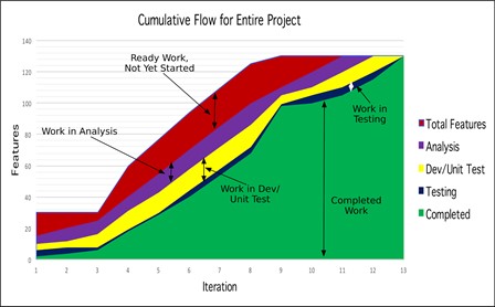
Johanna happened to use iterations in this chart, but you could use interim dates.
The product manager believed he needed to have the Product Requirements Document “complete” before the team could start. The project started before he could complete the entire document, so he continued to write requirements (everything in dark red) until close to the end of the project.
The team continued to evolve the architecture and parts of how the middleware connected to the platform, which is why the team had some stories in the purple (Analysis) state for a while.
Partly because of the analysis WIP, the team didn’t quite finish all the stories every iteration—the stories in Yellow, in the Dev/Unit test. The team knew why they didn’t finish, so they weren’t worried.
The team as a whole kept the testing WIP small (dark blue). Most of the time, the team completed the tests. And, the team was able to finish stories at a good rate once they got past Iteration 3.
When teams see where they have WIP, the team can choose what to do about that work.
Depending on the maturity of the team or the organization the boundaries of what we include in the CFD and how granular we look at the different stages will differ – maybe even differentiating between active and ready-for columns.
Use the Done and Not Yet Released Chart to See Intra-group Handoffs
We’ve discussed the issues of customer lead time already. We often discover customer lead time is a function of handoffs between groups. That’s why the Done and Not Yet Released Chart (from Create Your Successful Agile Project) helps everyone see the reality:
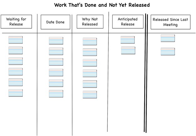
Back in their waterfall days, this client used a management-based Change Control Board. Managers attempted to assess the impacts of changes from ready-to-release software. However, the board only met once every two weeks. And, the managers were no longer sufficiently versed in the code to be able to assess the impacts on the customers.
If your team can’t release or deploy on their own, you might find this kind of aging chart helpful, too. (You might put the deployment into the cumulative flow diagram, as Michael often does. Johanna has found it easier to discuss on a separate chart.)
You might prefer other charts for your team. Regardless of the charts you choose, we recommend you update each chart as the team completes a useful item (or learns about changing circumstances).
In this part, we’ve covered different ways to measure actual progress and act upon these measurements. Please join us again for part 5 where we will finally answer the question of how much lean can (and should) be found in today’s agile and how all these parts fit together.
Part 1: How Much Lean is in Today’s Agile?
Part 2: Adaptability Enhances How We Work
Part 3: Looking at Systems to Enhance Outcomes.
Part 4: Explain dates to anyone with forecasts based on your historical data
Part 5: A Little Lean Can Create a Whole Lot of Positive Change


![[Case Study] From merger chaos to Agile greatness](https://www.agilealliance.org/wp-content/uploads/2025/01/chaos-to-greatness-color-150x150.jpg)


![[Case Study] From merger chaos to Agile greatness](https://www.agilealliance.org/wp-content/uploads/2025/01/chaos-to-greatness-color-300x158.jpg)

